Boosting Engagement
In-app announcements & other improvements to keep our users coming back
After the 4.0 release, it was important to ensure we didn’t stop there. The aim for the next iteration of the core platform was to improve user engagement to start building a loyal SURF Community.
Team
1 engineer, 1 Product Designer [me]
Tags
music, b2b, marketplace, discovery
Client
SURF Music
Time Constraint
1 Month
Following the launch of SURF 4.0, we knew we had to keep those initial users who took a bet on us to keep coming back. It was deeply important to me to show them that we care about their experience within our platform. Our first users are pioneers, willing to discover the newest and best technology and/or music tool. As we matured from a mere beta product to a fully launched platform, we needed to balance continued innovation with stability & reliability. We also needed to plant the seeds of building up an active user community, that will amplify our efforts in our product-led growth strategy. A community-led/product-led growth hybrid. After all, SURF centers itself around being for creators, by creators.
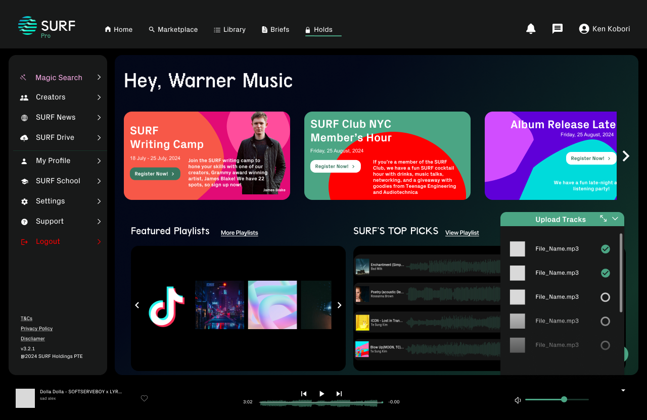
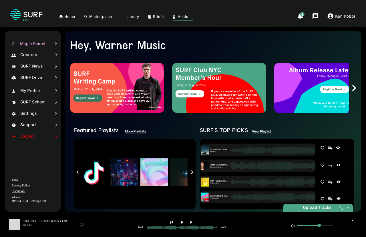
In-App Announcements: This announcement carousel design allows us to highlight the top important events for users to be aware of, whether that’s a community member’s happy hour or a new contest submission brief. This feature gives our users a reason to keep signing back in, to see what sorts of things are going on, encouraging further exploration of briefs, highlighted sessions, and in-person community meetups. This can also provide a good foundation for future giveaways and in-platform advertisements as an alternative revenue stream within the Freemium tier. We have to think about laying the foundation for several sprints down the line, now.
Light Mode: Another feature that was released this quarter was the light mode for SURF music. This was a direct ask from multiple users. Although this may seem like a simple UI change that only impacts aesthetics, the usability and sense of control a user gains from the option to select light or dark mode can greatly improve how our users feel toward the platform. Often times, developer-centric SaaS tools that are fully in light mode, have strong asks to release dark modes that use color to highlight Classes or Function names. In this case, the light mode may just be what one of our creators or buyers are used to using.
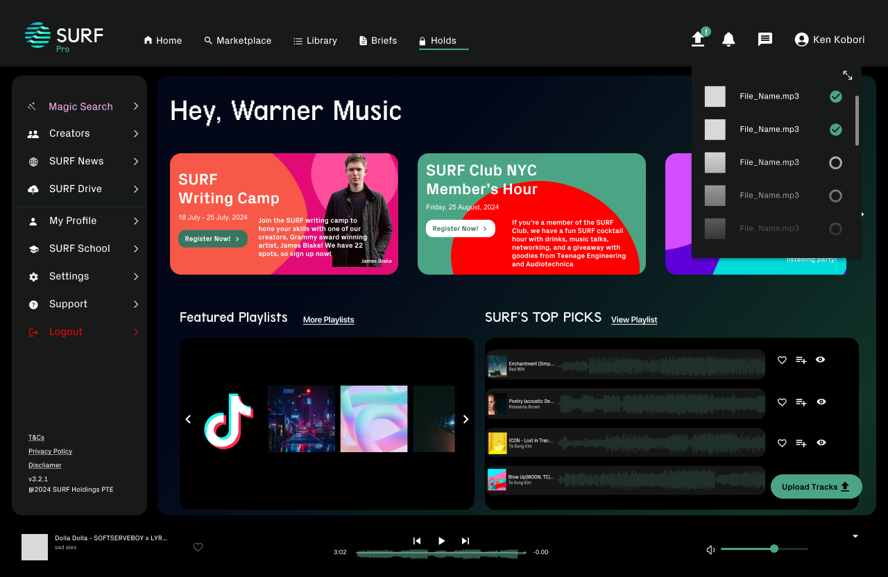
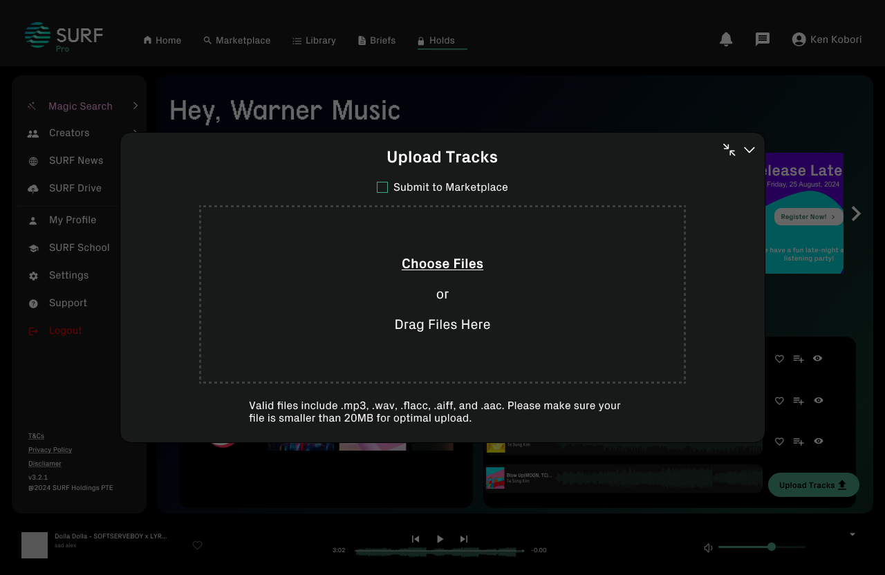
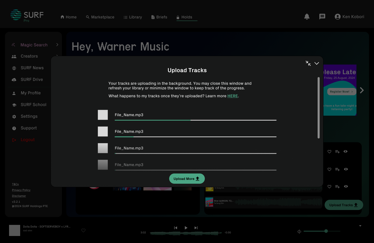
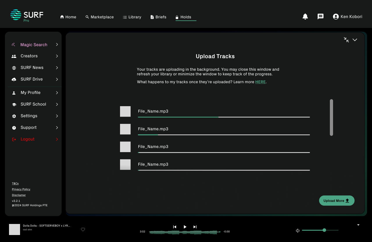
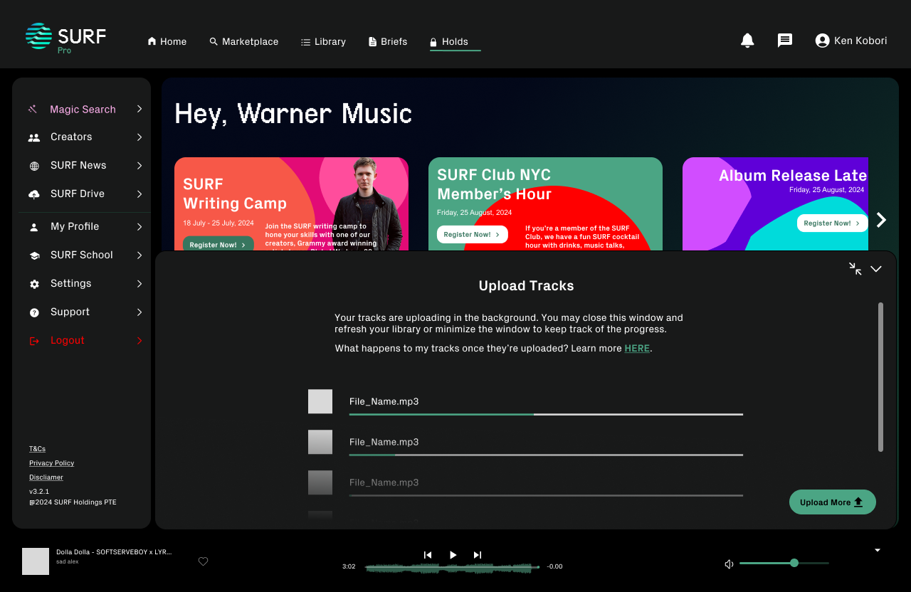
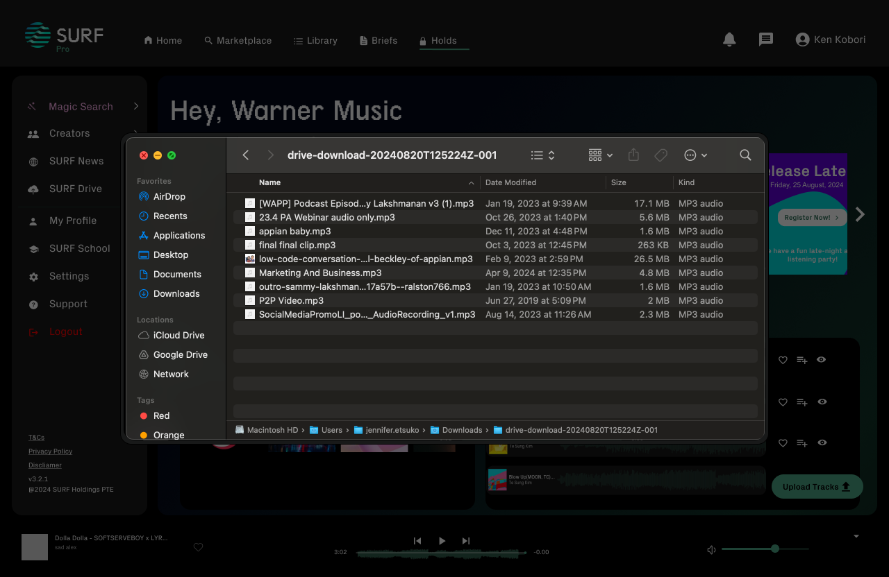
Providing Track Upload Status: Information transparency and understanding what is happening to your tracks when you put them in your library or submit it to the market place. IP and ownership over your art is vital to SURF’s mission. But the track upload experience was confusing and instilled some worry in many of SURF’s users, a common complaint in our customer support tickets. Adding a
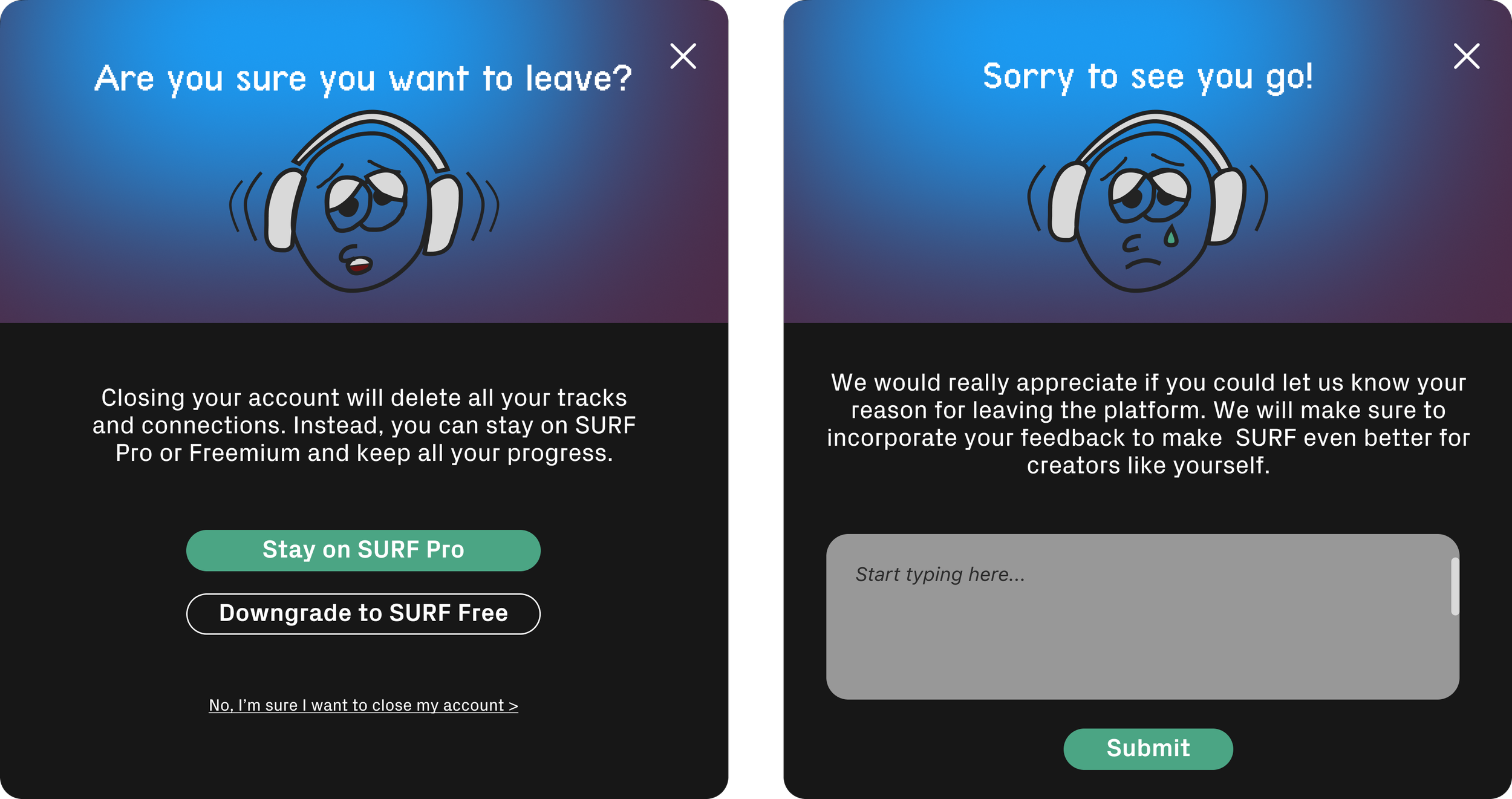
Downgrading Goodbye Cards : I also designed pop-up cards to make each feature discovery feel like an Easter egg. Who doesn’t love to feel like they found something special? This way, we can showcase the value that SURF Premium and Pro plans provide our users while remaining transparent and maintaining trust. You don’t want users to feel like the Freemium tier is a trap. You want users to see premium tiers as gifts.
Results & Impact
In-app announcements became a crucial part of our community-led growth strategy going into Q4 of this year. Light mode was a big user ask that we had to finally bite the bullet down on. These updates were more a kanban style let’s listen to our customers, let’s prioritize features, let’s build, and gather feedback. However, going into 2025, I am going to set up a more formalized UX research and user testing structure. This will allow us to make data-informed decisions and contribute to our GTM strategy for the coming year. We will be doing discovery sessions, user testing, contextual inquiries, and more with our MVP users, users who ask to disengage, and users who are infrequent but consistent. I envision that we may want to start building out a more creator-based dashboard that caters less to discovery and more to monetization for the creator user. However, we will have to test this hypothesis without leaning toward any bias. Exciting things to come…
So, how did we decide on which in-product announcement banner layout to use?
I started with a competitive analysis, looking at the likes of Netflix, Tidal, Spotify, Resident Advisor, and Runway. It was important to look at an array of both direct and indirect competitors, as well as platforms completely outside the music industry. I put together low-fidelity wireframes, which were discussed with SURF’s CMO, COO, and CEO. We had to align on our strategy for growth and engagement, as we look to grow SURF community, which will include both in-person and virtual events, contests, etc.
Light Mode Variations: Getting This Right
What it’s really like to be the sole designer at a small startup.
Being the sole and founding designer at a tech startup, consisting mostly of musician-turned business people, is a challenge. Like many organizations, design doesn’t automatically get a “seat at the table” until we showcase how design ties into strategy, user retention, behaviour, marketing, and all the other aspects of the company that contribute to its success. In the case study where I show how the menu and navigation layout impacts how a user uses our platform, this was something that I had to pitch to the CEO — your company needs a designer. That designer is me.
Words can only do so much, and people often react better to seeing an interactive prototype or visual, high-fidelity mockup. In my pitch, I showcased all the variations I considered, and the potential final outcome, which we later refined when the CEO and the rest of SURF’s executives were convinced that this would be worth investing in. So that was the foot in the door, and as we moved away from prepping the platform for the launch to figuring out how we can retain users, engage users, and build a community, there was no need for convincing and the team wanted me involved right away. This is how designers get a seat at the table.
This quarter began with strategy alignment meeting.
Lessons learned
In a startup, there are so many things that need to get done with very constrained resources. It’s not like a large enterprise where a few lost hours can be spared. Each feature we work on has to be thoughtful. However, sometimes things are done because of instinct and vision. The key is to create structure amid the chaos, while preserving the creativity and core that make the product unique.
As the sole designer working part-time on SURF alongside my full-time role, I learned the importance of:
Advocating for Design: To secure a place in key decisions, I had to consistently pitch my ideas and demonstrate their impact.
Establishing a Design System: I began a rudimentary design system I aim to scale in the next year with tokenization to streamline engineering hand-offs and maintain consistency.
Implementing Long-Term Strategy: I recognized the need for a formal discovery and research approach, planning not only for immediate needs but also for future quarters. I plan to start defining metrics and KPIs to measure our impact effectively this upcoming quarter.
Ultimately, I realized that building frameworks and systems will allow us to adapt, challenge, and meet emerging needs more confidently, enabling us to scale and succeed in a fast-paced environment. So, these learnings will be taken into what’s next for SURF Music.
What’s next?
As SURF prepares for substantial growth in the coming year, we face the challenge of designing for scalability.
Until now, SURF’s user base was carefully curated through a white-glove onboarding approach, where executives personally pitched to a select group of high-quality music producers and creators. However, to support rapid expansion, we must transition away from this manual process and focus on product features that automate quality control, protect against spam and copyright infringement, and maintain the platform’s integrity.
In addition to these safeguards, we will need to optimize SURF’s recommendation algorithm to balance visibility for all users while ensuring a satisfying experience for music buyers. This will be essential to building a well-functioning two-sided marketplace. With limited resources, I recognize we may need to prioritize one user persona initially before expanding our focus.
To inform this strategy, I plan to study successful design solutions from established two-sided marketplace platforms, particularly those outside the music-tech space, such as ride-sharing and short-term rental apps. These industries offer valuable insights into scalable, design-focused solutions for managing growth, quality, and user engagement—lessons we can adapt to meet SURF’s unique needs and drive sustainable growth. I am so, SO excited for this next chapter and remain agile to adapt as we dive into another year.


