Launching 4.0

Redesigning navigation to improve feature discovery
How do you transform a cluttered, underutilized platform into a sleek, engaging experience that skyrockets user growth by over 1,300% in just a few weeks? As the solo product designer at SURF Music—a B2B marketplace built by creators for creators—I faced the challenge of transforming a cluttered interface into an experience that felt intuitive, exciting, and essential. With a critical launch deadline and an upcoming Series A funding round, I knew this was about more than just UI. We needed a strategy that would make SURF’s standout features useful, engage users , and drive lasting growth.
Team
2 engineers, 1 Product Designer [me]
Tags
music, b2b, marketplace, discovery
Client
SURF Music
Time Constraint
3 Months
INTRODUCING:
SURF 4.0

To support an easy way to navigate all the features of SURF 4.0, we decided to go with an additional sidebar navigation, expanding the options the user has, without compromising visual hierarchy. We also decided to reduce the briefs, creators, and all homepage content to take up one line, so the user can see what other types of content they can explore. To support the large number of briefs or creators, we leveraged horizontal scrolling empowering users to choose whether they wanted to see more sessions or discover other things like creators or news.
Responsive redesign also ensured that the layout adapted to all screen sizes with fluid grids and scalable elements, rather than having awkward spacing and margins between each item and the sides of the screen.
tl;dr Here’s what we changed:
Hybrid Navigation Design: We introduced a side navigation panel alongside a top menu to make all the core features easily accessible. The top nav align with the bottom navigation on the mobile version, and the side bar provide immediate transparency into all the main features you can access with SURF Music. For example, the previously hidden Magic Search got a prominent spot, so users could see it right away. Connecting with creators, discovering briefs and sessions, and maintaining your music library are easily clickable and accessible.

+

Responsive Redesign: I implemented a fully responsive design using fluid grids and scalable elements to ensure a seamless experience across both desktop and mobile. On mobile, intuitive navigation and clarity were essential, helping users find what they needed effortlessly. Given SURF’s technical constraint as a browser-only application at this stage, optimizing screen real estate became critical due to the browser elements constraining vertical space.

Streamlined Homepage Layout: I identified an opportunity to simplify the homepage, condensing key elements like briefs and creator profiles into a single line for a quicker overview of available content. Previously, the “Featured Sessions” dominated the screen, obscuring other categories below. To address this, I introduced horizontal scrolling for each section, allowing users to easily browse through featured sessions, creators, and news without feeling overwhelmed or scrolling extensively. This approach provided a more cohesive layout, making it easy to explore all content at a glance.

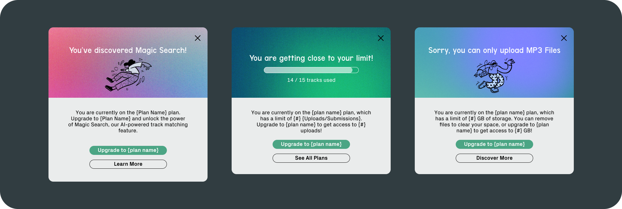
Engaging Upsell Pop-Up Cards: To make feature discovery feel delightful and rewarding, I designed pop-up cards that introduced each feature as a kind of hidden gem, creating a sense of excitement and value for users. These pop-ups highlight the benefits of SURF’s Premium and Pro plans, striking a balance between showcasing added value and maintaining user trust. While SURF is built with creators in mind, sustaining our business model also meant thoughtfully integrating upsell strategies that contribute to revenue growth. My goal was to ensure that users could clearly see the value in upgrading, while also preserving a satisfying experience for Freemium users—never making them feel like they were locked out of essential features.

Tailored Pop-Up Cards for Diverse Features: I crafted unique pop-up cards for each upgrade feature, infusing each with SURF’s distinct voice to create a fun, consistent brand experience. Each card was designed to resonate with our core message—that SURF is made by creators, for creators—ensuring that our tone remained authentic and engaging. By customizing the messaging, I aimed to balance user needs with business goals, providing a seamless introduction to premium features while reinforcing SURF’s commitment to creative empowerment. This approach allowed us to meet revenue targets while ensuring that users felt understood and valued, not merely upsold.

Results & Impact
The new layout was a crucial part in setting SURF up for not only the launch itself, but the predicted flood of new users that SURF would acquire following the launch. This was a strategic decision to improve feature discovery to make a path to up-selling users to the premium tier from the new Freemium offering. This redesign had some other pretty exciting outcomes:
User Base Boom: Our user base shot up from 960 to 14,018 right after the launch of SURF 4.0 — that’s a 1,360% increase!
Feature Engagement Spike: We saw a 420% increase in the use of “Magic Search” and other key features. The more prominent placement worked wonders in getting people to explore.
Conversion Rates Jumped: The Freemium tier led to an incrase of paid subscribers. Making sure users saw the value of upgrading paid off.
Positive Feedback: MVP users praised the platform as more intuitive and visually appealing, with easier navigation and better access to the features they cared about.
A little more context for the curious…
Before we dive into the WHY of things, let me briefly introduce what SURF Music is. SURF is a B2B music marketplace built “by creators, for creators”. It’s a way for musicians and producers to manage and post their unreleased tracks, which they can then submit to industry briefs to monetize and place on TV shows, commercials, or with popular artists like BTS, Kimberly Chen, and Little Glee Monster.
SURF is a B2B music marketplace built “by creators, for creators”.
SURF is especially great for breaking into the Asia music market particularly Japan and Korea, while keeping all royalties intact. The profit-eating middlemen and barriers to entry are two big problems in the music industry. With SURF, artists not only have opportunities for their “big break”, but also get to keep what they earn.
Despite its rich feature set, it was a struggle to find and engage with key features on the platform.
I was deeply invested in SURF’s mission, but I quickly noticed that the first version of the platform had a long way to go in terms of product experience. A few pain points stood out.
The platform had poor feature discoverability. Important features like SURF’s “Magic Search” — an AI-powered search system that can handle natural language prompts like “A cinematic track for a person crying under a tree at night” — were hidden away in a tiny corner of the Marketplace interface. This sick feature was pretty, and pink, but practically invisible.
There was also a lack of information hierarchy. The homepage was cluttered, and responsiveness on smaller screens was lacking. We now know that although most users access SURF on desktops, a significant 42%+ used their mobile devices for on-the-go listening and searching. We had to get this right.
And lastly, there was a missed opportunities for upselling. With the new Freemium tier launching alongside SURF 4.0, it was crucial to showcase the benefits of upgrading to Premium and Pro tiers and to motivate users to explore all that SURF has to offer.
After a candid conversation with one of the founders about these pain points, we recognized that these changes could be critical for the upcoming SURF 4.0 launch and Series A funding round. I pitched my redesign plan to the executive team.
The Old Layout


Both the old creator-side layout (left) and old buyer-side layout (right) were hard to navigate, required far too much vertical scrolling to see all the content that was displayed. The visual language was clunky and dated. All the functionality was there, but with the lead engineer working with 1 other front-end developer to build out the entire platform, product design and visual craft were not priorities at first. Seeing this as an opportunity, I pitched a redesign to the team and worked closely with the engineers, chief operating officer, and chief marketing officer to align goals and timeline for the upcoming product strategy as they focus on growth and customer acquisition.
We established our three main goals:
Make Key Features More Visible. Bring hidden gems to the forefront to highlight SURF’s value and retain subscribers. The platform’s value should be clear so users stick around and ideally upgrade to paid tiers.
Create a Seamless Responsive Design. Ensure the platform looks and feels great across all devices. A beautiful, intuitive design can greatly enhance how users feel while using SURF.
Simplify Navigation. Reduce cognitive load and empower users to decide what they want — and don’t want — to see.
What I did before I even thought about mockups
In order to pitch the art of the possible to the team, I curated a deck with a whole platform redesign. This was a significant undertaking, so I started with a more in-depth UX audit, relying on psychology heuristics and UX best practices. I played around in the platform extensively, exploring various flows to identify the main pain points. I also conducted a competitive analysis to spot common patterns from similar music platforms and enterprise SaaS software.
Quick and Dirty Competitive Analysis
I kicked things off by analyzing the design patterns of direct competitors like Musiio, along with indirect ones like Spotify, Tidal, and Apple Music. I also drew inspiration from more recent user-centered designs, like Arc by The Browser Company and Netflix. I had to think about who our users are — creatives who live and breathe in the world of high-caliber B2C product design. B2B or not, I knew we needed to make sure SURF didn’t feel like a boring corporate platform.
Given our tight deadline, I leveraged some quick, agile research methods — user feedback sessions and user journey analyses (with Amplitude) — to pinpoint where people were getting stuck and what features they were missing.
Ideation and Rapid Prototyping
I mocked up 10 low-fidelity wireframes based on common patterns in the music-tech space. I wanted to balance familiarity with a bit of SURF’s own flavor. We needed something functional yet visually appealing — think less “Excel sheet” and more “inviting creative space.” Through some internal testing, dogfooding, and rapid iterations, we landed on a side-navigation with a top navigation hybrid design that felt both fresh and functional.
I worked closely with our engineering team to outline technical constraints and ensure the new design could be executed smoothly. We kept iterating on the interactive prototypes and refining them based on continuous feedback.

Lessons learned, and what’s next?
This was my first big project as the sole product designer in a fast-paced startup. With just a few months to pull everything together before our Series A funding round, I learned a lot about working efficiently under pressure and prioritizing what truly matters to users, stakeholders, and the company. It reinforced the importance of agile research methods and rapid iteration, especially when time and resources are limited.
If I were to do this again, I’d start with a mobile-first design approach. We initially designed for the web, focusing on the desktop experience. Given that many users also discover tracks on the go, designing for mobile first would have clarified which features to prioritize, setting a better foundation for the desktop version.
Wrapping it up…
The SURF 4.0 redesign is just the beginning; it's the foundation for our future growth, community building, and long-term user retention. Our plan is to continue highlighting SURF's unique features, driving more users to explore the platform's full potential and encouraging upgrades to premium tiers. At the same time, we aim to deepen engagement and foster a vibrant community, making it the core of a sustainable, product-led growth strategy. By focusing on user needs and aligning design with strategic goals, we hope to continue building a platform that doesn’t just look good — but revolutionizes the music industry.
By Creators. For Creators.