runningcrews.com
website re:design
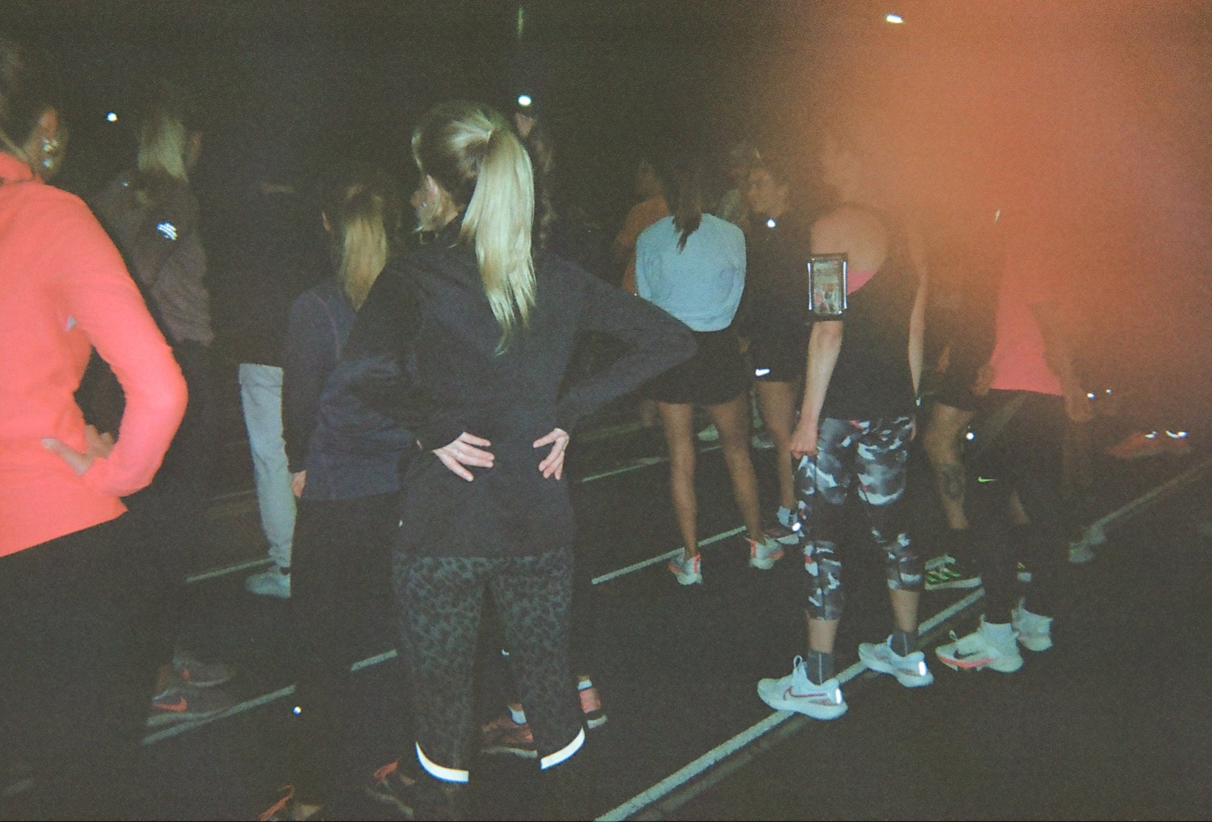
Urban running crews create a sense of belonging — a tribe. For lone wanderers who move to a new city. For youth who try and escape tough situations but crave belonging to a crew. People who want to get faster. Or people who want to grab a pint after 400s. For my MSc in Human-Computer Interaction course, I decided to do my Interaction Design project on how we could create supplementary digital resources that strengthen and make accessible the benefits of being part of a running crew: accountability, coaching, and community.
Use Case
MSc Interaction Design Module
Time Constraint
3 Weeks
Role
All - Independent
Tags
fitness, community, future interface
User Research
-
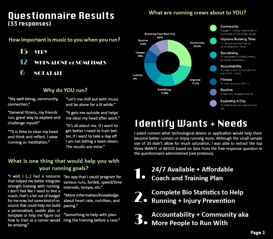
I conducted a short questionnaire around why people run and why people joined a running crew (or why not). I received 33 responses. When analysing the response, I found that people run for 3 main reasons:
Physical health
Mental wellbeing
Performance improvement (competitively)
-
The main reasons people joined running crews were:
Community/Socialising
Improving Fitness and speed
Accountability
Exploring a new city or their own city
-
When asked what people would want or need to help make running more enjoyable/help their performane, they responded that:
They would want 24/7 coach and training plan
They want comprehensive statistics about their bodies to prevent injury and enhance performance
Tech that facilitates accountability and community (including more people to run with!)
Defining User Personas
Re:designing runningcrews.com
Running crews are about community, but it’s daunting to find a running crew, and the only online database that exists, is runningcrews.com — which has a very hard to use interface and no community or personalisation involved. From the research, we found that one of the strongest reasons people join running crews is to feel “part” of something bigger, including going to events with people, socialising, being held accountable, and learning about various running-related things. Since there was no website that reflected these factors that people expressed as “what running clubs are about”, I decided to refactor running crews.com to have these additional features:
Community page
Ability to log in and thus personalize your dashboard
Making signing up for a newsletter easier (to increase community engagement)
Aesthetic that aligns with the running crew vibe
Critique and Evaluation of runningcrews.com
The existing interface was very confusing and hard to navigate. There was no menu bar, which meant you had to click through various paths in order to get to the list of running crews, or to find information about a specific running crew. The map interface also looked quite clunky and not streamlined.
Flexibility + Efficiency
This is also another heuristic that is a good one to evaluate the navigation on as it is important to have various ways to get back to the homepage and to be able to jump to the other important pages. there shouldn’t be a need to scroll down the homepage to click on a link to navigate there. The best way to address this was the hamburger navigation.
Aesthics + Simple Design
This was the most simple aspect to improve. I focused on consistent colors that reflected the “cool” factorand cleaner layouts.
Consistency + Standards
This feature was extremely important to improve, as the navigation was sometimes at the top right, sometimes thorugh the homepage, sometimes in a list, etc.
Match of System + Reality
This wasn’t a huge pain point of the website as we use Google maps all the time to locate landmarks and navigation. However, the reality of running crews is not just locating the crews, but also the community aspect of it.
Low-Fidelity Wireframes + User Requirements
I started my design process by focusing on the user persona, Rob Beumer, or the Urban Running Crew Runner (URCR). later on, I will address the other user personas in the future work section that aims to bridge the gap between the urban run crew community and other types of runners as run crews can be intimidating to join and don’t accommodate some of the needs and pain points of the other types of runners. More on this later.
By focusing on the needs and motivations for our user, Rob, I was able to sketch a very rough idea of how the new runningcrews.com should look. This included a huge emphasis on community and personalized/targeted events, information, and search results. These recommendation algorithms will be based on user-item matrices providing an even stronger sense of community and connection with other runners.
Proposed Design
Homepage + Navigation
Community Page
Crew Profiles
Starting with the homepage, it was important to make the map easier to navigate by decluttering all the running crew logos and having them appear upon hover. It’s important to consider accessibility when implementing this feature, ensuring the markers are clickable themselves, and have alt text so that non-sighted users or users with minimal dexterity can still navigate to the individual running crew page. Furthermore, I added a hamburger navigation menu to make it simpler to navigate the site, especially with the additional ‘Community’, ‘Events’, ‘Submit Crew’, ‘All Crews’ and profile pages. This also demonstrates the user being able to log in to their account, which will be a way to personalize what is shown through recommendation algorithms — we can assume this will use a simple Singular Value Decomposition (SVD).
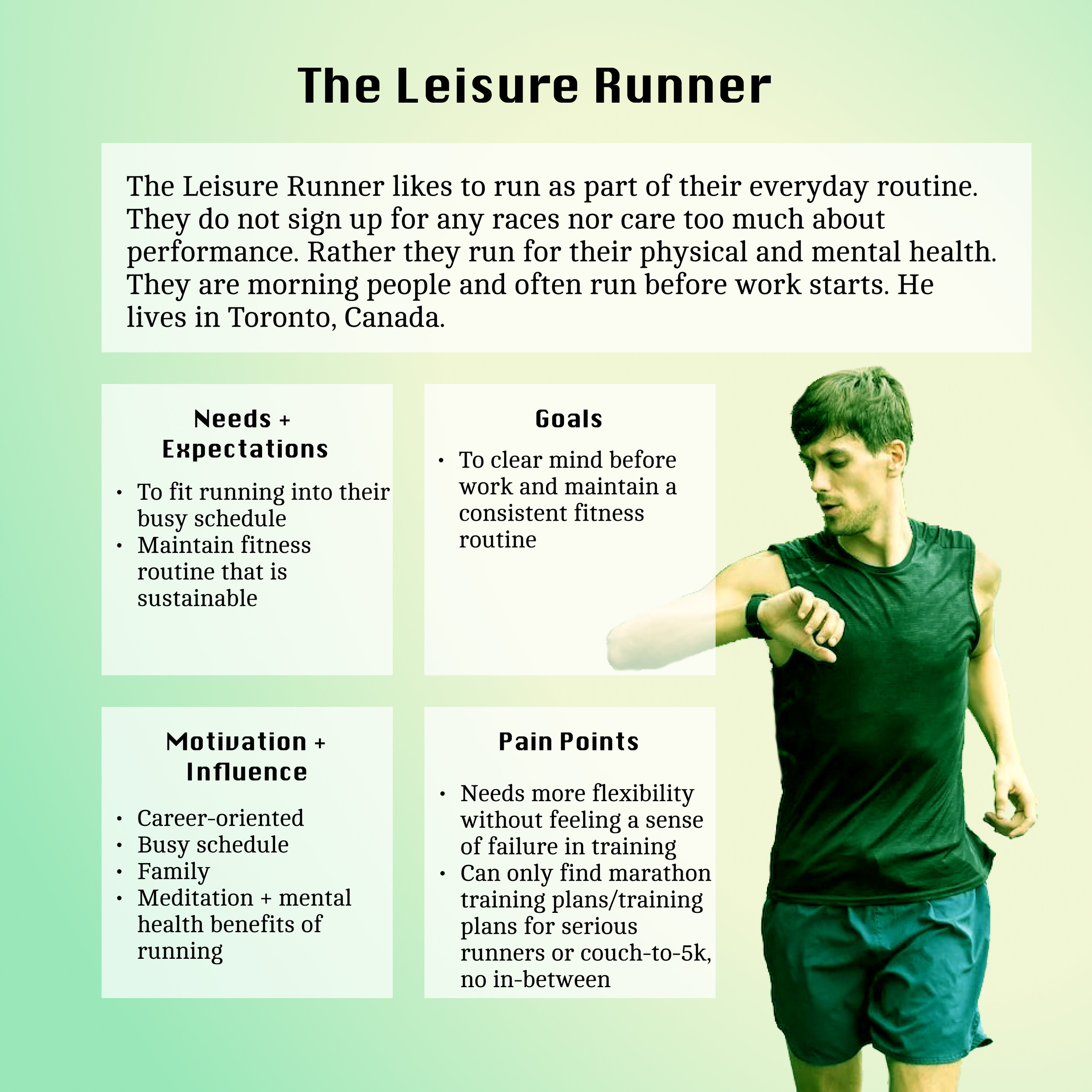
For this redesign, we are considering the user persona: The Urban Running Crew Runner (URCR). We integrated the URCR’s needs, goals, motivations, and pain points and addressed the original runningcrews.com interface critique based upon Nielsen’s 10 heuristics (shown above).
One of the biggest reasons people join running crews is for the community aspect . Therefore, it was important to have a community page that was curated for the individual and provided a curated dashboard for all the events they are attending, running meetups, podcasts, and run crew affiliations. I have also added in the shadow box newsletter subscription upon landing on the page (initial login only). In the future, I would also add in a “Friends” section that would indicate what their friends have been up to, or even a Strava or Garmin integration. Although there are many potential additions that can be implemented here, this basic prototype is to display the foundation for a more robust dashboard.
The running crew profile pages are similar to what the runningcrews.com pages look like but with a more chic, “running crew culture” aesthetic that could be customized by each running crew to fit their vibe. A lot of running crews are diverse in their missions, who they represent, and what sorts of “vibes” they have when you join them. To be able to showcase this is important.
Crew Submissions
Another page I want to highlight is the crew submission page. As you can see in the original interface evaluation, the “Submit a crew” button is simply at the top right side, making it appear a bit random and out-of-place. Having the submission as part of the general navigation bar eliminates the confusion and streamlines all user actions. Furthermore, the submission button led to a ‘404 Not Found’ page anyway, so having this embedded form was an easy improvement to the existing interface.
Adding the social links to this page was also really important so that upon submitting their own running crew, the user can look at other community
Events + Search
One of the major points of improvement was also the events page and search. The current search only searches on the running crew names. Whereas, I think the search method should include various filters to allow the user to search based on location, on date/time, on event names, on run crew names, etc. I believe that having a personalized events page in addition to the search field on the home page would be extremely useful. There are some improvements that could be made regarding having a ‘Search’ tab on the hamburger navigation bar instead of “Events” and “All Crews” although this is something to explore in user testing.
Looking into the future: an exploration
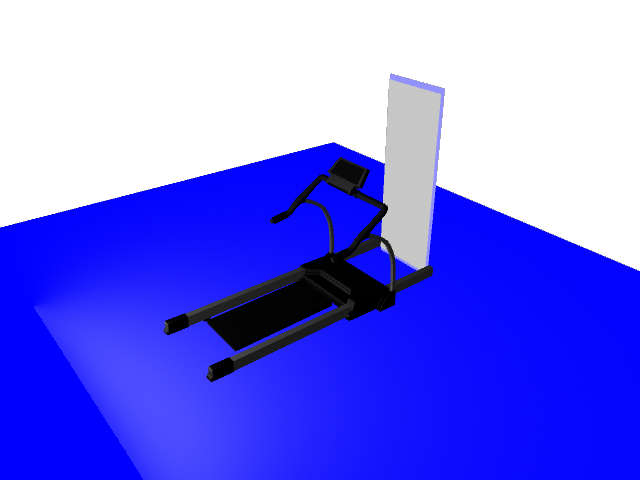
So, as much as this redesign of runningcrews.com has addressed the community and identity needs of the “Urban Running Crew Runner”, I believe that this website can be integrated with a ‘smart treadmill’ in order to address the needs of the other personas. Particularly, the “Couch-to-5K” runner and the “Leisure Runner”. The professional runner is most likely better off with a personal coach who can provide the best care for them, in person. However, my design for a ‘smart treadmill’ can address the “Professional Athlete’s” needs as well in the case that they are traveling or their coach is unavailable for any reason. Again, the point wasn’t to design a product that will necessarily replace existing professional coaches or in-person run crews, but rather to take what people enjoy from in-person coaching and run clubs, to provide it to the runner who doesn’t have enough time to go out and about, the runner who must watch their kids but would like to maintain training, the runner who doesn’t love running quite yet, or the runner who is too embarrassed to run in public. Using the insights about why people haven’t joined a run crew, why people love running, and why people who are in run crews continue to participate — I have gathered key features that will make this smart treadmill a desirable product that can emulate the aspects of: fitness, coaching, and community.
The Physical Product
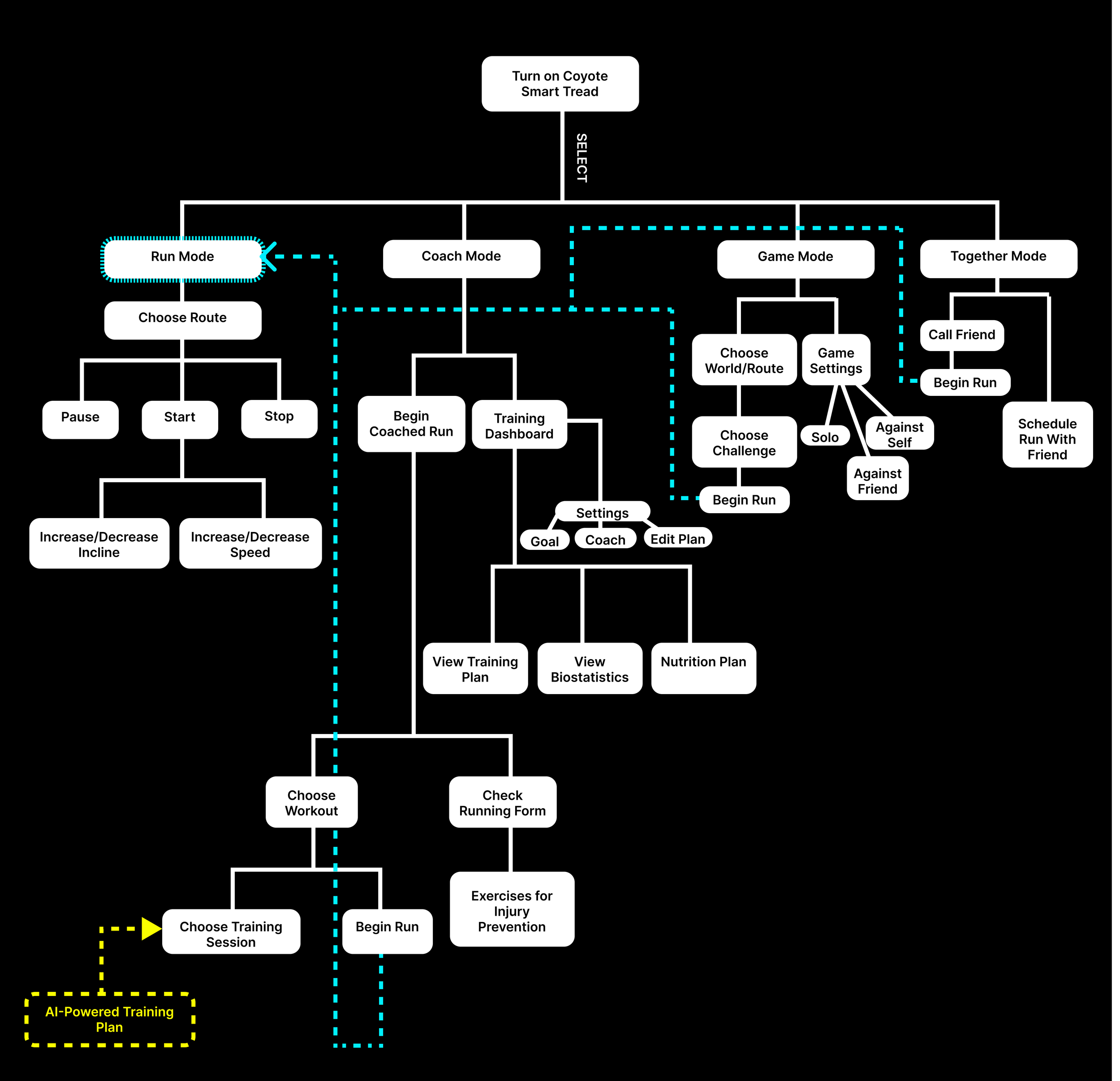
The future is not just about interfaces on an app or website but interactive technologies like smart thermostats and smart ovens that integrate into people’s everyday lifestyles. With Lululemon x The Mirror and mixed reality (MR) technology surfacing, I created a very rough prototype of what an integrated smart mirror would look like — so I introduce, COYOTE. This smart treadmill addresses the needs of the other runners who want to experience the benefits and community of an urban running crew but may have both physical and personal constraints such as living in a more remote area where there are no running crews, not feeling ready to run in public, unable to leave the house, etc. Therefore, the smart mirror can integrate with runningcrews.com to offer a sense of community, training and motivation for all runners alike. Of course, there are limitations to this product in the sense that it will limit its users to people who can afford to have a COYOTE smart tread in their homes, people who are able-bodied, and people who like interacting with technology. There are some game-ification features that were considered in the interface design of what would appear in the mirror itself. However, this area should be further explored through questionnaires administered to target users and evaluated for technical feasibility with an engineering team.
The Rendering
Reflections
— Musing N°1
Re-designing a digital product teaches a designer how to be critical of an existing website or application, and see how it could be done better… maybe even in a whole new way. Looking at websites that are not built from scratch by you is a way to expand your mental archive of various styles, formats, interactions, and flavours. It also trains you to seek for ways to make an interaction even better or better suited to the purpose of the page.
— Musing N°2
Every day we face challenges or inconveniences… but we often brush them off and work around them. What if, instead, we decided to come up with a way to address them? If you find something “annoying” or “frustrating”, you’re probably not the only one. Large chances are, many others are thinking the exact same thing… but it has become so normalized in the fabric of our daily routine that we forget that we can be the solution. And that’s what design thinking is all about. Sometimes it just takes shifting your mindset.
