PAUSE
A symptom tracking self-care intervention
We aimed to develop a health management application that assists individuals in identifying whether they are experiencing perimenopause, long COVID, or both. ‘PAUSE’ aims to help people better understand their health, connect with others with shared experiences, and enable symptom tracking to provide physicians with accurate health data for diagnosis.
Use Case
MSc in HCI: Human Factors for Digital Health Module
Time Constraint
2.5 Weeks
Role
High-fidelity mockups/prototyping, user testing, user personas
Tags
health tech, women’s health, reproductive health, COVID
THE BRIEF
The brief for this activity was to design, prototype and test an application to support people managing long COVID based on the analysis of user needs drawn from existing resources and digital behavioural intervention (DBI) and other digital health theories. This brief was provided by the module leaders for the final coursework.
Secondary Research + Ideation
The whole group of six did secondary research looking through papers on digital intervention and behaviour change theories as well as interviews and anecdotes from people who experienced long COVID. This is where we were finding a large group of women who had experienced long COVID, perimenopause, or both, and felt they were not supported nor provided with enough resources to understand what was going on in their body. Many women got misdiagnosed for one or the other, which exacerbated symptoms and often prolonged recovery. We felt that this issue was a gap in the existing pool of long COVID and COVID management applications. Thus, we decided to do a second round of secondary research but with a focus on this user group. We then collated our research into major themes through an affinity diagram. We created an evaluation matrix of the various pain points and desired features that these women expressed.
Affinity Diagram from Secondary Research
Evaluation Matrix [Desirability x Feasibility]
Defining Product Vision
Primary Problem:
Many people are misdiagnosed with long-covid but are actually dealing with symptoms of perimenopause and therefore not receiving the care and support from their healthcare providers. Part of the issues is lack of education in this space as well as lack of support and resources for individuals who have (or have had) a menstrual cycle.
KPIs + Potential Impact:
Although this was a student design concept project we kept in mind several key metrics that would reflect the app’s success (beside common metrics like app download and user retention):
Number of users who successfully managed their symptoms through tracking and using the education/support resources provided in the app (via NPS)
Level of engagement such as users that contribute to the support platform in the app (# of posts, # of comments, # of likes, # of direct messages)
Value Proposition
What:
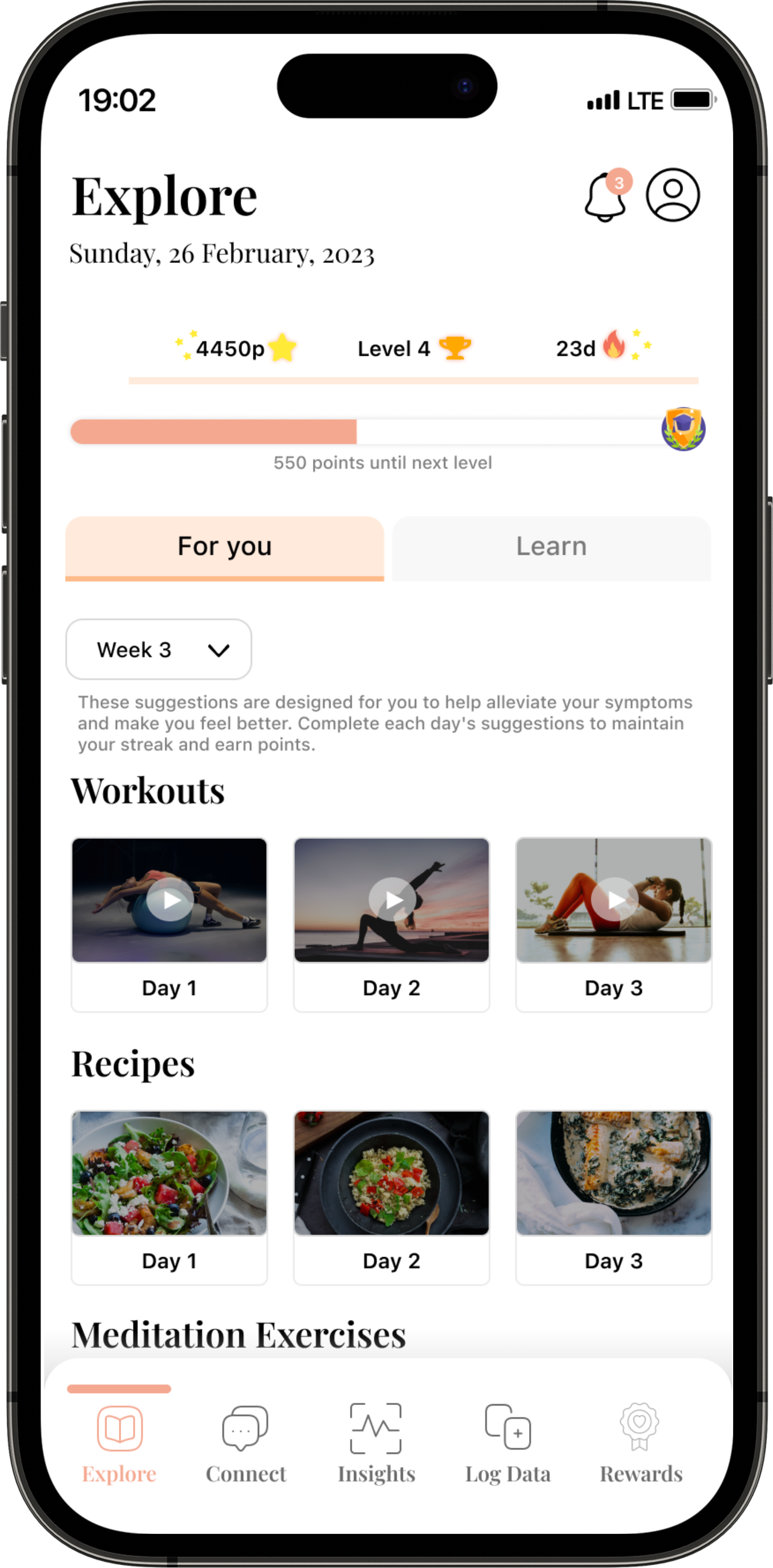
An app to allow users to track their symptoms along with their menstrual cycle so that they can be empowered with data to make informed decisions about their health.
Who:
Individuals who are dealing with various symptoms that may be linked to either peri-menopause, long-covid, or both.
When + Where:
Mobile application
User Personas
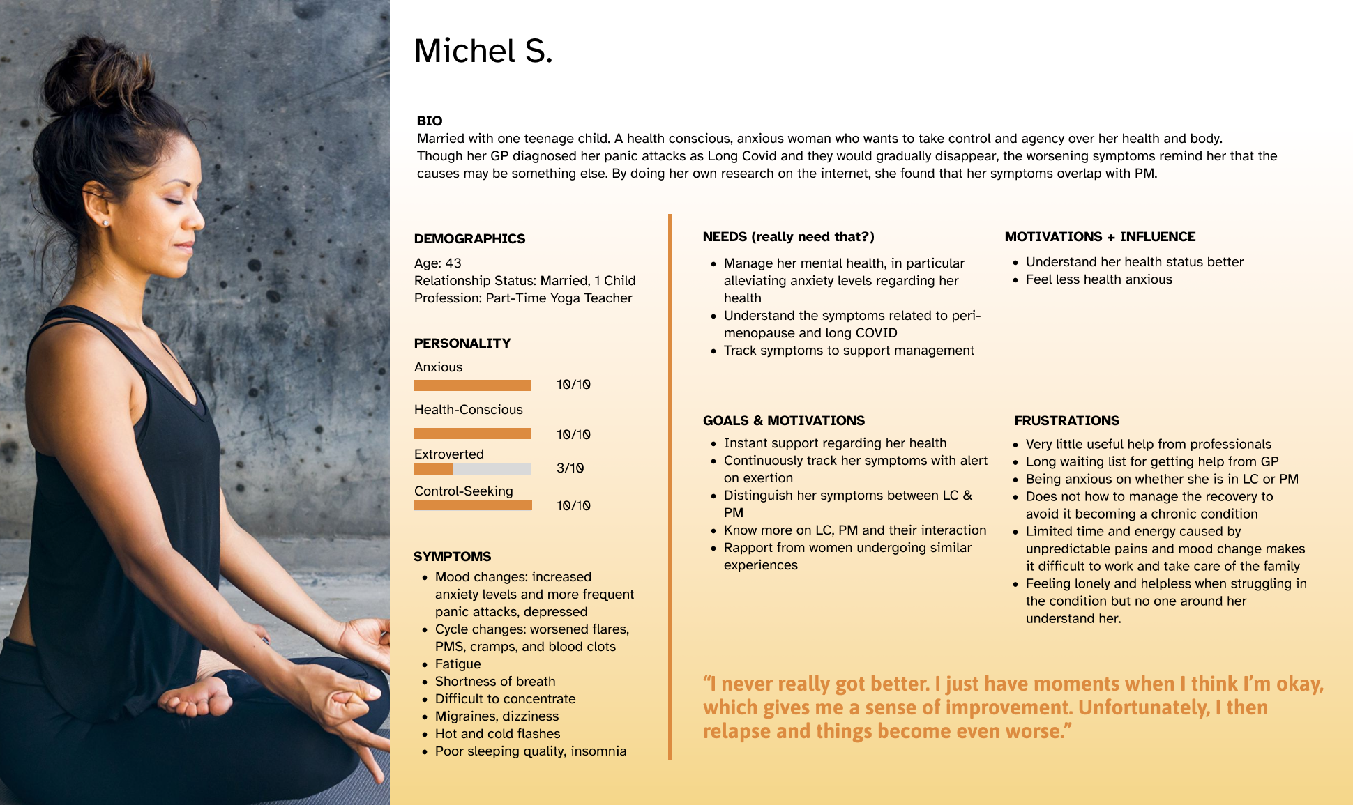
We came up with three women who had varying lifestyles and personalities, which shape the way in which they may use the application and what their primary goal for using it would be. For example, Abigail is very introverted and feels quite isolated. Her main driving factor for using PAUSE would be to connect with others and talk or read about the experiences of people going through a similar situation. Sasha, on the other hand, is an extremely busy career-driven woman who wants simple and understandable data visualization so she can bring it to her doctor for a better understanding of the changes in her body. Michel is very health anxious and wants to know every detail on what is going on in her body and what she can do to manage her symptoms.
The Resulting Design
User Testing
v.2 | Refine the Designs
We incorporated the feedback from the user testing and heuristic evaluation to create a more intuitive and seamless design. We made several main changes:
Making the text bigger
Reducing number of clicks required to log symptom and its intensity
Final Submission
Video Submission
Report Submission
Reflections
Learnings N°1: Keeping higher-level product vision and business model in mind when ideating a new product
The prompt for this project was very narrow and defined and had some constraints regarding access to primary user research due to ethical clearance. However, that is exactly the type of project that required some out of the box thinking. Although the solution was targeting a niche problem and a very niche population, it pushed our team to identify gaps in the current market. The issue with our solution was that the target user group may not download the app in the first place because they are unaware of the possibility of misdiagnosis. The app we designed would not acquire the breadth of target users we would like nor would it have a high retention rate due to the primary goal of the app: to help users identify a misdiagnosis. Once they identify it, they would stop using the app and go to their GP or OB/GYN to receive treatment. As designers, it is important to understand the business model of our product and larger business goals.
Learnings N°2: Having two silos and defined roles was helpful, while working iteratively
It was important that roles were defined and work streams were siloed to research and design tasks. This was an important lesson that I took with me from yemaya. We touched base 2-3 times a week, ensuring that our overall product vision was aligned. I was able to take on the role as the leader of the project, touching base with all our team members and scheduling the meetings so that we remained on track without being redundant. I was able to employ the agile development process skills I acquired during my employment at Appian in a product design setting.

