COLLISION
MVMT.
OVERVIEW
COLLISION was born from our passion for music, art, and US-Japan relations. My siblings —both musicians— wanted to bring together their creative communities from New York and Los Angeles, and introduce them to our creative hub in Tokyo. As a visual artist and tech nerd, I used my skills to create marketing materials such as artist tiles, flyers, and post-event promotional video content. Our hope is that COLLISON MVMT will be the inception of lasting relationships that transcend borders and allow people to share, create, and dream together.
CLIENT
Collision Movement (Co-Founded)
SCOPE
January 2018 (1 month)
IMPORTANT: If you are someone who has photosensitive epilepsy or are prone to seizures, please do not scroll down further. There are graphics with “glitch” effects that may trigger physiological reactions.
LogoDesign
LogoDesign
This logo was a collaboration between myself and my sister, Christina Higa aka AYAKO. The concept of this logo is rooted in the powerful balance of three and the connection between us three siblings, the founders of COLLISION MVMT. The lines that cross over not only provide stability in the foundation of the pyramid, but also come together in several intersections to signify the crossing of multiple paths. COLLISION MVMT hopes to create lasting global relationships that transcend borders and allow people to come together and converge at many points throughout their lives.
Social Media & Flyer Art
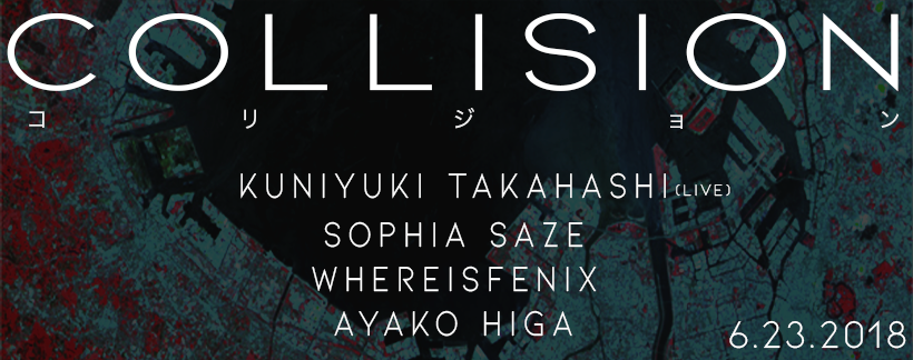
When conceiving the design for the event flyer, there were several important factors we evaluate. We wanted to ensure that our flyer embodied the essence of COLLISION. My siblings and I grew up in a very international environment where many of our friends were from different corners of the globe. However, we were all tied by the land of the rising sun, Japan. Hence, the main centerpiece of the flyer is the white, transparent circle in the middle signifying these two elements.
Variations for Each Media Platform
Social media has become increasingly more important in disseminating information. Social media platforms often vary in consumption methods. For Instagram or other mobile-forward applications, I ensured to create a “block” format. For our Facebook or RA Ticketing service sites that rely heavily on desktop or laptop computer users, we created a horizontal cover format that spans across a wider area.
Artist Tiles
I used Adobe AfterEffects to create these gif animations for each artist performing at our event. The glitch effect is meant to embody our desire to disrupt the underground music and arts scene in Tokyo by connecting artists from across the world. We found many artists through countless hours of digging through digital archives of similar music and artists that align with our vision and style. Disclaimer: As these were made in 2018, before I started learning about inclusive design, I regret that I did not make these graphics more accessible. I understand there may be concerns with overstimulation or photosensitive epileptic triggers that were not considered. This is something I wish to investigate further down the line.


